
COVID-19 has made everyone a data analyst overnight. We are inundated with information about the virus: charts showing new cases, deaths, maps, and - of course - line charts with exponential growth. In an effort to provide clarity and insight, the ReconInsight data team has compiled a list of our “go to” sites for COVID-19 data.
Our team is based in the US and Canada, so the websites we are sharing are predominantly measuring data for our home countries. We’ve also included sites for Spain, Germany, and Norway.
Before we begin our list, we feel it is important to remember that while data analysis is a vital part of preparedness and response to a pandemic, these numbers represent loss of life and an ongoing battle in many parts of the globe.
Thank you to all of the healthcare professionals for their life-saving skills and knowledge.
Thank you to the data professionals who have made this valuable information accessible to all.
To our readers, please stay safe and keep on social distancing! We are all in this together, and we hope this list provides resources to stay informed while staying home.
Global
#1 WorldoMeter Coronavirus Tracker
Worldometer is run by an international team of developers, researchers, and volunteers with the goal of making world statistics available in a thought-provoking and time relevant format to a wide audience around the world. It is published by a small and independent digital media company based in the United States. We have no political, governmental or corporate affiliation.
Chris says: “I see my wife reloading this page throughout the day, while we are both working from home. The site uses simple and effective charts; and the extensive use of tables is excellent.”
Kristyn says: “Not only is this site updated multiple times an hour, but they also recently started tracking testing data for all countries. Sources are provided for all, so if you are curious to have more information on a specific country you can go directly to the country’s website.”
A screenshot of the main data table on Worldometers.info. Data shown is from April 5, 2020. Screenshot was captured on April 6, 2020.
#2 Google’s COVID-19 Community Mobility Reports
From Google: As global communities respond to COVID-19, we've heard from public health officials that the same type of aggregated, anonymized insights we use in products such as Google Maps could be helpful as they make critical decisions to combat COVID-19.
These Community Mobility Reports aim to provide insights into what has changed in response to policies aimed at combating COVID-19. The reports chart movement trends over time by geography, across different categories of places such as retail and recreation, groceries and pharmacies, parks, transit stations, workplaces, and residential.
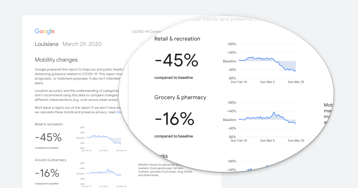
All other sites we share in this post report on near-real time COVID-19 case totals and death totals. Google’s COVID-19 Community Mobility Reports, however, offers PDF summaries based on location that are updated approximately once a week (so far). Per Google: “These reports will be available for a limited time, so long as public health officials find them useful in their work to stop the spread of COVID-19.”
Chris says: “Google dropped this ‘data bomb’ late last week. Google has aggregated location data from millions of mobile devices to explain people’s movements. This site measures how well people are heeding advice to travel less, visit less parks, and work from home. Google already has a baseline, which means they already understand user behavior prior to COVID-19. Measuring new behavior against this historic baseline makes this report possible.
Countries and tech companies have been debating how to use mobile consumer location information without compromising privacy. Google skirts this issue by aggregating user data, which means they take individual customer data into a larger data set. Once the individual customer is mixed in with a larger number of customers, they argue the data is anonymous. On a related note you can always turn off Google’s location tracking on your mobile device.
My wife manages a town in Eagle, Colorado. A large part of their budget comes from sales tax and sales tax reporting lags two or three months. Eagle and regional governments are studying this Google report to understand the potential impact on sales tax revenue. If they see a -35% change in retail store visits on this report, they can begin to understand the COVID-19 impact on government revenue while they wait for sales tax actuals.”
United States
Our co-founder, Chris; data team member, Kim; and marketing consultant, Kristyn, are all Americans. Chris is based in Colorado, Kim is in California, and Kristyn lives abroad in Norway. Whether you live in America or have family and friends in the US, here are some of our go-to sites on American COVID-19 data.
#3 IHME COVID-19 Projections

A screenshot from the COVID-19 Projections site, captured on April 6th, 2020.
covid19.healthdata.org/projections
The Institute for Health Metrics and Evaluation (IHME) is an independent global health research center at the University of Washington in Seattle, Washington, USA.
Chris says: “This has rapidly become a popular site for many Americans. While other sites report on existing cases, this site projects health care demand as well as death rates. The data is aggregated by state and at the national level. In addition to analytics, each state’s page lists any state-wide government-mandated social distancing orders that are in place.”
Please note that this site uses mathematical modeling to provide projections. All projections are based on multiple assumptions, baseline data, and subjective rules. At best, projections are educated guesses. As a responsible consumer you must take this into account when viewing this information. Click here for the latest updates to the model.
#4 Johns Hopkins University COVID-19 Map
This dashboard, “Coronavirus COVID-19 Global Cases” is managed by the Center for Systems Science and Engineering (CSSE) at Johns Hopkins University (JHU).

A screenshot showing a partial view of the JHU COVID-19 Dashboard, focused on the map visualization. The US data is dispersed geographically on the map by county. Canada’s data is shown geographically by province.
Chris says: “Ken shared this page with me. This map does an effective job of showing the distribution of cases around the world. It is worth noting the map is only as good as the data that is loaded. Specifically, only the US shows local data, Canada provides province-level data, and the rest of the world is represented at a country-wide level.”
#5 John Burn-Murdoch’s Twitter Feed @jburnmurdoch
Chris says: “Burn-Murdoch is a talented information visualization specialist for the Financial Times. He maintains multiple COVID-19 charts with daily updates, and it has become part of my routine to check them every morning.”

One of John Burn-Murdoch’s charts for the Financial Time’s. Data shown is as of April 5, 2020. Screenshot taken on April 6, 2020.
#6 The COVID Tracking Project
The COVID Tracking Project collects and publishes the most complete testing data available for US states and territories. This project was launched out of The Atlantic to fill a major gap in publicly available COVID-19 testing data. Johns Hopkins University maintains a comprehensive case count, but no governmental or institutional source is publishing complete testing data—including not just identified cases, but how many people have been tested, and where. Without this data, we can't make informed decisions or accurately communicate risks.
Kristyn says: “The COVID Tracking Project measures data for each individual US state and territory, provides ‘data grades’ (from A-D) that rank the comprehensiveness and regularity of each state’s reporting, as well as historical daily and cumulative totals for each state and the entire country. They also provide access to their spreadsheet for data nerds that want to analyze the data themselves.”
Canada
Two of our teammates, Kevin and Ken, are Canadians.
#7 Government of Canada’s Coronavirus disease (COVID-19): Outbreak update
canada.ca/en/public-health/services/diseases/2019-novel-coronavirus-infection
The Canadian Government has created a dedicated website for tracking and sharing national Coronavirus data, information, and historical statements/press releases.
Ken says: “An excellent resource for Canadians looking to understand the current situation here in Canada.”

A screenshot showing the geographical data visualization on the Canadian Government’s Coronavirus update website. The map is interactive and shows further analysis in the line graph based on the province you hover over. You can also click ‘play’ to see the timeline the spread of COVID-19 in Canada. This image was captured on April 6, 2020.
#8 BC Center for Disease Control
bccdc.ca/about/news-stories/stories/2020/information-on-novel-coronavirus
Per the British Columbia (BC) Center for Disease Control: A new coronavirus is causing a respiratory infection known as COVID-19 around the world and in B.C. The province is working to break the chains of transmission.
Kevin says: “This government-run page is updated on a daily basis with the latest numbers and statements from my province, British Columbia.”
#9 COVID-19 Stats in Alberta, Canada
Data notes provided by Alberta: The Provincial Surveillance Information system (PSI) is a laboratory surveillance system which receives positive results for all Notifiable Diseases and diseases under laboratory surveillance from Alberta Precision Labs (APL). The system also receives negative results for a subset of organisms such as COVID-19. The system contains basic information on characteristics and demographics such as age, zone and gender. Information such as hospitalizations and ICU admissions are received through enhanced case report forms sent by Alberta Health Services (AHS).
Ken says: “This site is concise, clean, and easy to digest. It provides up-to-date information for all Albertans.

Canada’s Alberta province website provides a highlight dashboard with quick numbers, and a selection of additional graphs and charts showing more detail on demographics, outcomes, testing, and more. Screenshot taken on April 6, 2020 showing data as of April 6.
Germany
We have a number of friends in Germany and asked them which website they go to for COVID-19 data. Germany has been lauded for its low mortality rate, but in recent days the fatality rate has begun to rise.
#10 Robert-Koch Institut (RKI): CoVID-19 Dashboard
The Robert Koch Institute is the public health institute for Germany. Our goal is to protect the population from diseases and improve their health. Every day, 1,100 people from 90 different professions work and research on this at the RKI.
Kristyn says: “A good friend of mine lives in Nordrhein-Westfalen which is the second most impacted German state with nearly 22,000 COVID-19 cases out of 103,375 as of April 7th, 2020. The RKI is Germany’s equivalent to the American CDC and is a highly respected and trusted source.”

A screenshot of the RKI COVID-19 Dashboard showing geographic case distribution and density; demographics, and daily and cumulative totals. The chart in the bottom right shows new cases by day: the blue represents cases as of yesterday, and the orange is “newly reported (today).” This screenshot was captured on April 7, 2020 showing data from April 6, 2020.
Norway
Our marketing consultant, Kristyn Dorr, is based in Stavanger, Norway. Norway was quick to implement large-scale testing and tracing protocols after identifying their first COVID-19 case on February 26.
At the Norwegian government’s daily press conference on April 6, the Minister of Health, Bent Høie, said, “Norwegians infected with the corona virus now infect an average of 0.7 others. That means we have the corona epidemic under control.” Høie went on to share:
Before the stringent [social distancing] measures were introduced, each infected person would infect 2.5 new people. If this development had continued, we would have seen the same development as elsewhere in Europe in Norway […] The government’s goal was for each infected person to infect a maximum of one other person […] The measures we have implemented have meant that we have gained a solid takeover, we must keep that.
#11 VG: The Corona Virus Spread in Norway and the World
Verdens Gang (VG) is the most read online newspaper in Norway. VG created a dedicated page for COVID-19 data in Norway and the world very shortly after the first case was identified in Norway in late February. They utilize the Norwegian government’s centralized reporting system on COVID-19 cases in addition to manually checking all local municipality websites for the most current information.
Kristyn says: “VG’s COVID-19 data analysis is extensive. They have visualizations on hospital preparedness for all hospitals in Norway; demographics of confirmed cases and deaths, including country of infection; health care professionals with confirmed COVID-19 diagnoses and those in mandatory quarantine. It is a hefty site, and that is just describing some of the Norway data - they also have a collection of global data analysis.”

A screenshot showing the top of VG’s Coronavirus data page. Captured on April 7, 2020.
Starting at the upper left, the charts show: Deaths (New today, Total); Hospitalized (Right now); On respirator (right now); Registered cases (new today, Total); Tested (as of April 5); Healthcare professionals cases [sick] (right now); Healthcare professionals in quarantine (right now).
As of April 7, Norway has performed 111,299 COVID-19 tests, with a testing rate of 20,530 per 1M pop. The only countries with higher testing rates are Iceland and the United Arab Emirates.
Spain
Chis has a close friend in Spain, which has been hit hard by COVID-19. As of April 6, Spain has the highest number of cases and deaths per capita of any country in the world.
#12 Wikipedia Entry: 2020 Coronavirus Pandemic in Spain
en.wikipedia.org/wiki/2020_coronavirus_pandemic_in_Spain
Wikipedia’s disclaimer at the top of COVID-19 pages: This article is about a current pandemic where information can change quickly or be unreliable. The latest page updates may not reflect the most up-to-date information. Please help improve this article using reliable sources or help by discussing changes on the talk page.
Chris says: “My friend in Spain depends on Wikipedia for the latest information on Spain’s COVID-19 outbreak. Wikipedia is doing excellent work in this pandemic. It pulls data from all countries regularly and all information is well-cited.”
Wikipedia has created and maintained a wealth of information on the COVID-19 global pandemic, and their coverage of Spain’s outbreak is no exception. Here are just a few examples of some of the data visualizations they have included on the Wikipedia entry. This screenshot was taken on April 7, 2020.
COVID-19 data transparency
It is amazing to see the thoughtfulness and transparency that governments, health organizations, news outlets, and individuals are putting toward making COVID-19 data available to all who seek it. Not only that, but seeing the different ways like-data is presented and the variances in what data different places and organizations prioritize and measure over others.
A lot is unknown about what will happen in the coming days, weeks, and months. Utilizing the plethora of data on COVID-19 for visualization and analysis creates a small safety net for those of us who appreciate understanding the ‘knowns’.
One thing is certain: COVID-19 is not just a matter of case numbers and death counts. The more time you spend analyzing the data across states, countries, etc, the more complex it becomes.
Thank you, again, to all of the healthcare professionals on the front lines taking care of all those affected by this pandemic. Thank you to all the data professionals who manually review and compile COVID-19 data to be publicly accessible. Thank you to all of you reading, who are staying home and social distancing for the health of our communities. Stay safe and be well.
What are your go-to sites for COVID-19 data? Comment below.