
Let’s continue the dialogue Kevin and I started in “Iterative business analytics: interview with the experts.” As the title mentions, today I’ll be presenting how we (the RI Data Masters) apply iterative development when creating dashboards. I have a few goals:
Show an example of a strategic dashboard, focusing on high-value data points that address specific goals
Sprinkle tips and tricks throughout for building dashboards that are easy-to-use and nurture data culture
Illustrate the customer experience with ReconInsight using iterative development to build strategic dashboards quickly
To meet these goals I’ll be sharing one Dashboard Story: an example of how ReconInsight helped one of our customers develop a strategic dashboard for their customer service department over 3 iterations.
I’m excited for this blog post! My favorite thing to do is play with data, and I got to do a lot of that in preparation. Before we begin, a few thoughts on data visualization and iterative development…
Data visualization strategy
A few years ago I was chatting with a woman that had a career designing dashboards, reports and other information visualizations. She mused that after being asked over and over again what she does for a living, one day she responded with, “I make pretty data!” This was her go-to response from that day forward.
This sticks with me as I spend my days creating Ri360 information dashboards for clients and training them to create their own. Sometimes I include the phrase #MakePrettyData, giggle to myself, and remember the story of the information visualization professional years ago.
Of course making data pretty isn’t what’s most important, but it is important. The adage “it’s both an art and a science” certainly applies to dashboard design.
First, the information presented in the dashboard must meet the end user’s requirements. A dashboard that has meaningless charts, values that do not hit the mark, or extraneous visualizations is a failure.
Second, the information presented must be balanced on the screen, arranged visually, and use colors consistently.
Let’s keep this concept in mind as we walk through this Dashboard Story that illustrates the evolution of a dashboard designed for strategic use. “Evolution” is a fitting term as it fits into the RI iterative business analytics approach. Every dashboard we build starts with a basic exploration of a few data points and then quickly evolves into a useful solution that meets the customer’s specific need.
Using iterative development to build strategic dashboards
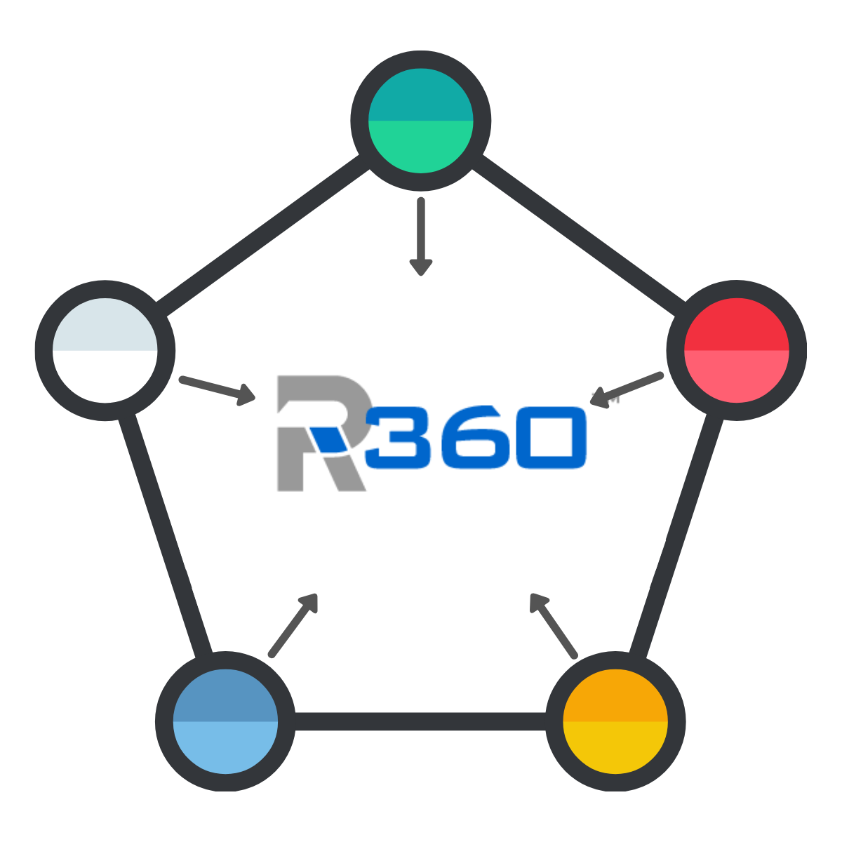
We always use iterative development when working with our customers to develop strategic information dashboards, data visualizations, and reports. How RI data analysts approach iterative dashboard development: 1) customer requests, 2) RI data master build, 3) RI data master shares new solution for customer review, and then the cycle repeats with 1) more change requests. A few reasons why we love iterative:
SPEED: Iterative development needs much less planning (if any) compared to traditional project management. Our Data Masters need very little information from our clients to get started. Iterative development also has quick turn around from our data analysts. Our customers do not have to wait more than a few business days to get a new or updated solution based on their requests.
COLLABORATION: The process of requests, build, review, creates an empowering environment for our customers. The first iterations offer a great learning experience to become familiar with their data and how they can view and manipulate it. As they continue developing dashboards with their RI data master, their confidence and understanding naturally grows.
Now the fun begins!
Dashboard Story: Customer Interactions
This dashboard story includes 3 iterations, with an extra 4th iteration that shares additional options and a discussion about the customer’s next steps. It is worth noting that while we may ‘finish’ a dashboard in so far as the iterations end, change requests are always welcome from the customer.
From here on out, I’ll be using ‘The Company’ when referring to our customer (so we don’t confuse our customer and our customer’s customers). Before starting the build, the RI data master asks The Company’s business expert and leadership a few quick questions:
What will this dashboard be used for? Will it align with a specific strategic goal?
This question is as much for The Company’s benefit as it is for ReconInsight’s. It helps the RI Data Master understand what this dashboard will address and how they can apply their expertise to create a valuable end-product. In this case, The Company replied with, “This will be the first in a series of dashboards relating to tracking and measuring the performance of our customer support department. We have a number of goals to address, and will probably focus on short-term or long-term analysis to start.”
Who at The Company will use it / should have access to the data? Who owns this dashboard?
The RI Data Master will use this information to set-up security permissions for internal users, as needed. The Company responded with the names of team members who should have access to the dashboard as well as the name of the dashboard’s strategic owner.
Which business systems can this data be found in?
We ask this as a fail-safe to make sure we include data from all applicable systems when creating reports for the dashboard. The Company provided specific names of the systems that include customer support data, but I’m going to list the systems by function for the purposes of this post, “Our customer support data can be found in our website chatbot service, online support forms, email marketing, customer support CRM, and call center software.”
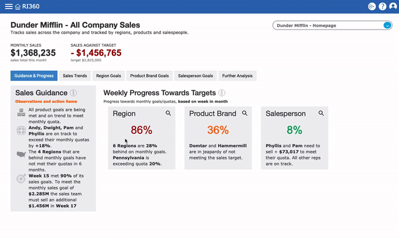
Iteration #1: a quick build
Step 1: Requests | The business expert at The Company requested two things for the first iteration: that the dashboard show activity counts by reason (1) and resolution (2). Since The Company hadn’t seen the data yet, their request was broad and intended to provide guidance to the RI data master so their returned solution had a goal.
At this point, ReconInsight wants to get data in front of The Company as soon as possible so they can start evaluating the information and establishing what they care most about.
Step 2: Build | An effective way to summarize categorical data such as “Reasons” and “Resolutions” is the pivot table. A pivot table is essentially a top-10 list. They are informative and many business users prefer the detailed view of a pivot table.
For the first iteration of the dashboard we simply place two single value pivot tables -- again, think “top 10 list” -- on the canvas. This allows the business user to get a grasp of the data volume and data breakdowns.
The first iteration provided to The Company by the RI data master. First iterations typically have the fastest turnaround from ReconInsight, usually within 1 business day.
Step 3: Review | The RI data master quickly returns a basic dashboard that addresses The Company’s two requests. After receiving the first iteration, the business expert and leadership at The Company review the dashboard. The new dashboard encourages them to explore their data and Ri360’s capabilities.
Upon receipt of the dashboard, the first iteration is complete and we move on to the second iteration cycle, which will include feedback and requests from The Company.
Iteration #2: more clarity
Step 1: Requests | With the second iteration, The Company better understands what they are looking for / care most about from a strategic standpoint. They requested the following for the next iteration:
How do the interaction counts change over time
Additional visualization options for “reason” and “resolutions” breakdowns
Step 2: Build | I love pivot tables as much as the next data nerd, but The Company’s request for visualizations is understandable. Charting is an invaluable part of dashboard design - seeing patterns at a quick glance can only be done with visualizations.
Per The Company’s request, we switch out the “reasons” pivot table for a trend line showing daily interaction counts. Next, we change the “resolution” table on the left to a traditional pie chart for a graphical representation of the top 10 list and immediately one can see that a single resolution is dominant.
We also built a new bar chart using a third pivot table that quantified customers based on how many times they had called the support department in the last 365 days.
The second iteration of the Customer Interactions dashboard provided to The Company.
Step 3: Review | Once again, the RI Data Master shares the newest iteration of the dashboard with The Company’s business expert and leadership. The stark difference between the first and second iterations is quickly apparent. For The Company, seeing the same information represented in a different way and seeing new information (i.e. the bar chart), keeps the business analysis gears turning.
The Company chooses to take a bit more time in their review of this iteration to fine tune their strategic goals for customer interactions. The second iteration is complete, and the RI team waits for the next round of change requests from The Company.
Iteration #3: final changes (for now)
Step 1: Requests | While The Company strategically reviews their dashboard, they revisit the initial questions the RI data master asked, “What will this dashboard be used for? Will it align with a strategic goal?”
The Company’s business expert and leadership collaborate to document their strategic goal for this dashboard:
This dashboard will track long-term customer interaction trends. At minimum, it will be reviewed during weekly meetings with support staff; and monthly meetings with the executive support and operations teams.
Its purpose is to measure interaction volume over time, interaction reasons, interaction methods, and interactions by support representative. This data will help us make informed decisions with staffing, staff training, which support methods to invest in, and more.
The business expert sent the above description to their RI Data Master, and we got to work.
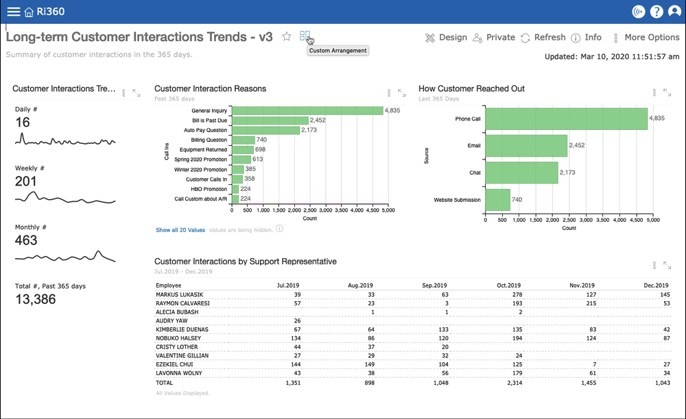
The third iteration of the Customer Interactions dashboard.
Step 2: Build | We started by changing the Customer Interactions Trend chart to a series of spark lines that show interaction volume by Day, Week, Month, and Total # for the past year. Each of these values can be analyzed in more detail using Ri360’s data levels feature, but the goal for this dashboard is at-a-glance information.
Next, we changed the “reasons” pie chart to a bar chart so The Company can easily see volume comparisons (as opposed to percentages).
We switched the “How many times has a customer called in” bar chart for the “How Customer Reached Out” bar chart to address The Company’s request to measure interaction methods.
For the bar charts we used the same green color to indicate that value it is measuring is the same (customer interaction counts).
Finally, we created a new pivot chart (Top 10 List) of The Company’s support representatives by interaction volume month over month.
Step 3: Review | The RI Data Master finishes the latest changes to the dashboard within a few business days. This time we schedule time to meet with The Company’s business expert to share the newest iteration.
While on the call we also educate on a few Ri360 features that will come in handy while reviewing the dashboard on their weekly and monthly calls, such as data levels and summary analysis. We also show how to adjust time frames within reports and how to change the dashboard view from Custom Arrangement to List View.
With Ri360’s “View” feature, you can toggle between Custom Arrangement, List View, and Tile View of all your dashboards. You aren’t limited by the space on the screen when arranging a dashboard.
As usual, the ball stays in The Company’s court as they review the newest dashboard. Once the business expert has reviewed the dashboard with leadership, they let us know that they are happy with where the Long-term Customer Interactions Trends dashboard is at, and that it is ready for use.
Additional options and next steps
As an example, I want to share another way to present the same data. The options for reporting and visualizing data are limitless. Iterative dashboard development is a high-impact methodology that helps Ri360 customers decide how they prefer to consume information.
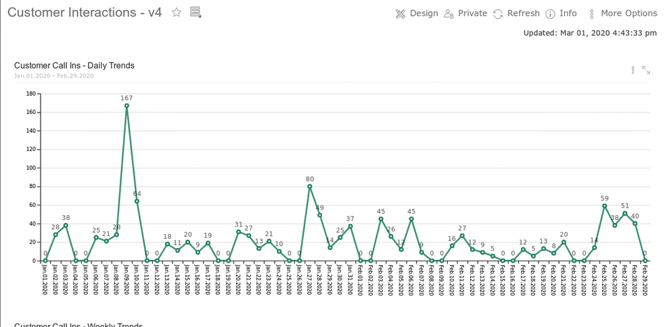
The same customer interaction data from previous iterations visualized in different ways.
Next Steps | Now that the “long-term customer interactions trends” dashboard has been completed; The Company is ready to build a second dashboard - but this time with a short-term focus. They send the request to their RI data master: “For our second customer support dashboard, we will focus on short-term (daily / weekly) performance to keep a pulse on the support department, how it is performing, and other strategic focus areas for short-term monitoring and response.”
Building off of the first dashboard, the RI data team gets to work once more. And the iterations continue.
Final Thoughts
It goes without saying (but I’ll say it anyway) that Kevin and I are very proud of our highly-skilled and experienced data team and the services we provide. Our top priority is ensuring our customers get value from their data quickly and easily. When our data masters manage the technical aspects of Ri360, it allows our customers to focus on their data and their business analytics goals.
A few parting thoughts on iterative development for business analytics dashboards and data visualizations:
Iterative development is best whether you have a data analyst or not. Work quickly, don’t overthink/over-plan. Seeing the data helps business experts and leaders figure out what they want / like / see value in.
Focus on visualizations that add value and emphasize the data, visualizations do not need to be flashy for the sake of flashiness.
It is important to think critically and strategically when building dashboards: who is using it? how often? Why is it important? There are a lot of ways to build dashboards. Iterations allow for experimentation and exploring multiple options / paths / solutions.
Done right, iterative development can nurture data culture. It builds value in business analytics and allows the business users to focus on what works for them and do away with the rest.
We’ve mentioned this many times, but in case you are new to ReconInsight: we include data analyst services in the monthly subscription to our business analytics software, Ri360. ReconInsight’s data team also manages the technical set-up of your Ri360 environment, during which our data analysts work with you to develop custom-built strategic dashboards.


Spotlight on an Ri360 marketing Integration - Klaviyo reporting for multiple clients; and reporting from various data sources.
2 MIN READ