We’ve compiled this list using our decades of data visualization experience. It is full of easy-to-implement recommendations for streamlining the day-to-day use of your analytics technologies. Each tip offers a functional or strategic way you can improve the efficacy and/or efficiency of your business data. We’ve done our best to make this a general list and not software specific.
#1 Use colors consistently
Purposeful colors add clarity to what the data presents and can make data analysis faster. When creating a dashboard with multiple charts, use the same color across charts when they represent the same group or metric.
Before: Random Colors
Difficult to see and randomly chosen colors make deciphering this dashboard time consuming.
After: Purposeful Colors
Bold, organized colors align like data for quick analysis.
Two approaches to implementing color consistency in your dashboards:
Easy mode: Start implementing intentional color choice on individual dashboards, like in the example above.
Hard mode: Assign specific colors to common metrics at your organization and use those colors consistently in all dashboards and data visualizations.
#2 Implement naming conventions on dashboards and reports
Naming conventions are just another way to a strategic layer of organization to your dashboards and reports. Defining your department or business’ naming convention may take some up front time, but the time saved in the long run will be worth it.
Before:
After:
The ultimate end goal would be for all users to understand and use your naming convention. It is an easy way to instill best practices data culture, and build confidence for all users that they know what a dashboard includes without opening it, they can find what they are looking for, and quickly identify whether a dashboard they are thinking of creating already exists or not before creating duplicate content.
#3 Utilize descriptions on dashboards, charts, and reports
Make the most of available features in your data visualization software by utilizing the description field on your dashboards, charts and reports. Keep your descriptions concise -we recommend defining whatever filters may be applied to the data (i.e. time frames, etc).
Before intentional titles and descriptions.
After implementing naming convention on dashboard titles and adding valuable descriptions.
#4 Build for your user’s screen size
Understanding your user’s screen size is especially important when building dashboards. In most cases, visualization tools will auto-adjust for mobile, but when viewing on a desktop the dashboard may vary depending on the size screen it was built on/for.
It may not be realistic to make a dashboard that works for everyone, so we recommend catering to whatever the most common screen size is for the dashboard’s users. Such as a sales team that frequently travels and works from their laptops, vs an operations team that works predominately from desktop monitors at one location.

Example #1: Cramped
This dashboard was built by a user with a large 22” monitor. For other users accessing the data using a laptop, their view of the dashboard is cramped and cut-off.

Example #2: Too Spacious
Alternatively, if a dashboard is built using a smaller screen when the general audience uses a desktop monitor, the dashboard content is smaller and difficult to read.
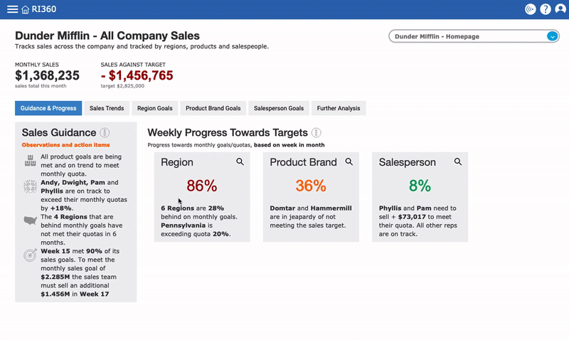
Note: Ri360 also has a handy feature that allows you to switch between “views” so you can see your dashboard in a way that works best for your screen regardless of size.
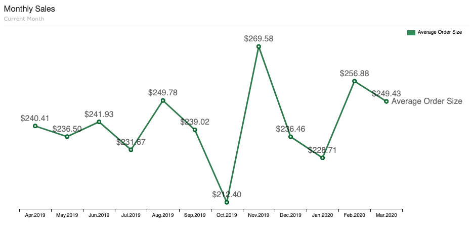
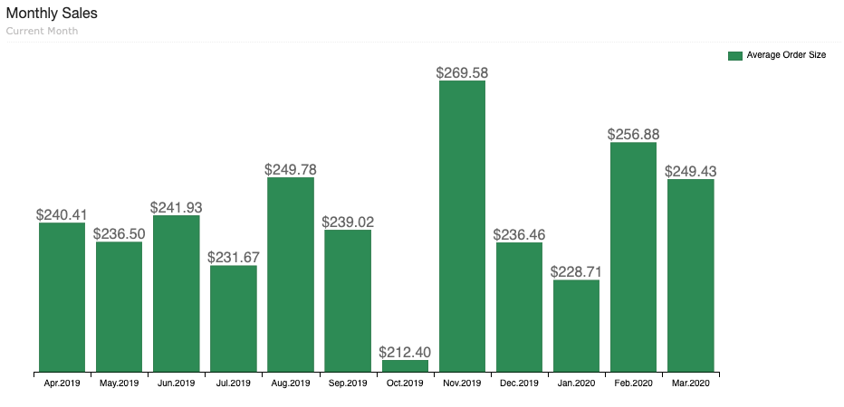
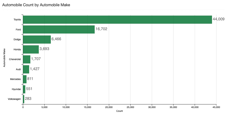
#5 Add number labels to charts
This one will depend specific features on your data visualization technology, it may be a feature you can toggle on and off or may be a default setting.
Number labels on data visualizations are an easy way for viewers to quickly understand their data.
#6 Pay attention to time frame
If a report or chart is filtered by a specific time frame, make sure to note it in the description or title. Additionally, when adding charts to a dashboard make sure they are filtered using the same time frame (unless you are specifically creating a dashboard to show comparisons of the same value over various time frames).
#7 Assign ownership of dashboards, folders and reports
Whoever owns the data from a strategic or management standpoint should also be listed as the owner of any dashboards and reports related to that data. Clear ownership helps make sure the data is monitored, maintained and tracked. It also alleviates friction if a user has questions because they can connect with the data owner. Reduce friction, clearly define responsibility.
#8 Be aware of what visualizations work best for you (and the business)
Feel free to use the same visualization over and over again if you find that it works best. If there is a visualization that makes sense for your business and the data you measure, use it as much as you see fit. There is no rule that says dashboards can’t use the same visualization more than once.
The goal of all data visualization is to be easy-to-read and quick to add value. Knowing how what visualizations are most useful to you is a key piece of the puzzle.
#9 Know when to create a second dashboard
When it comes to adding charts to a dashboard, know when less is more. Shoving a ton of charts onto one dashboard is a rookie mistake. It is better to have 10 dashboards that each have a specific purpose than to have 3 behemoths that you are scared to look at.
Be sure that every chart you add to a dashboard is useful to the dashboard’s story and trim away anything that isn’t.
Final Thoughts
All of these recommendations are intended to be easy ways you can make small functional or strategic improvements to make the day-to-day use of your analytics technology streamlined and more productive. One way to foster a powerful data culture is by reducing friction between your users and data. Hopefully one or more of the items in this list stuck out to you and you can start implementing them at your organization!